
Here's something that every designer knows deep within. Colour is never merely decoration. It influences emotion, affects perception, and subtly controls how individuals engage with a brand. That is what colour psychology in branding is all about. It speaks about how a certain colour can make a brand trustworthy, bold, playful, or luxurious, and how design decisions impact what individuals remember about it.
At MAAC, design students are taught early on that colour is not merely about what is aesthetically pleasing but also what feels right. Colour psychology design knowledge makes them think beyond visual and venture into how audiences feel about colour at a deeper level.
What recent research tells us
Latest research indicates that up to 90 per cent of snap decisions on products are made on the basis of colour alone. Blue is what people perceive as reliability, red as passion, green as freshness, and black as sophistication. It is not by chance. Our brains link colours to feelings and experiences, and these shape perceptions of brands.
It is for this reason that colour use in design is one of the most strategic aspects of designing visual communication. Blue, for instance, is frequently used by technology brands because it represents trust and stability. Red or yellow are favoured by food and beverage brands since they arrest attention and stimulate appetite. Muted or monochromatic colours are favoured by minimalist as well as luxury brands since they project elegance and power.
When MAAC students work on design projects, they learn how these decisions unfold in live branding. They learn to investigate audience behaviour, cultural meanings, and even the way colours can make the message completely different.
Colours for brand identity
Selecting brand identity colours is a combination of art and psychology. An expertly designed colour palette provides a brand with its personality and emotional voice. Consider how easily recognisable Coca-Cola red or Tiffany blue is. These colours have become symbolic. That is the power of using consistent colour.
MAAC's design training teaches students to play around with palettes and understand how different tones have varying effects. From hands-on exercises, they learn how changing a single colour can change the way people perceive an entire brand.
Colour psychology for logo design
Logos are where colour selection counts the most. Colour psychology in logo design assists designers in choosing shades that indicate what the brand represents. A green logo could imply eco-friendliness. A yellow one could imply optimism and creativity. The idea is to utilise colour with purpose so that it aids the message the brand intends to convey.
Through learning about the psychology of colour in branding, MAAC students master the application of theory to practical projects. They merge creativity with sensitivity to the influence of colour on human emotion and behaviour.
Colour is effective because it communicates before it speaks. It is among the first things that individuals pick up on about a brand and among the last that they remember. Mastery of colour psychology design enables future artists and designers to utilise colour not only for aesthetics but for meaning. Under the tutelage of MAAC's professional mentors, they are taught how colour in design can transform mere visuals into enduring impressions and how knowledge of colour can create better, wiser brands.


13 October 2025
The Psychology of Colour in Branding: What Recent Research Reveals & How Designers Apply It
Recent Posts
How to Build a Career in Anime: Exploring 2D and 3D Animation Opportunities in India
Beyond the Classroom: How Studio Visits Give Animation and VFX Students Real World Industry Exposure
How VFX Transformed Indian Cinema: The Rise of Visual Storytelling on the Big Screen
Essential Tools for Digital Creators: How a Digital Content Creation Course Prepares You for Real World Production
From MAAC Classroom to Mirzapur: How Animation and VFX Training Can Lead to Successful Careers in Film and OTT
A Parent’s Guide to VFX Careers: How MAAC India Helps Students Prepare for Careers in Top Media Studios
From Sketchpad to the Silver Screen: What You Learn in a 3D Animation Film Making Course
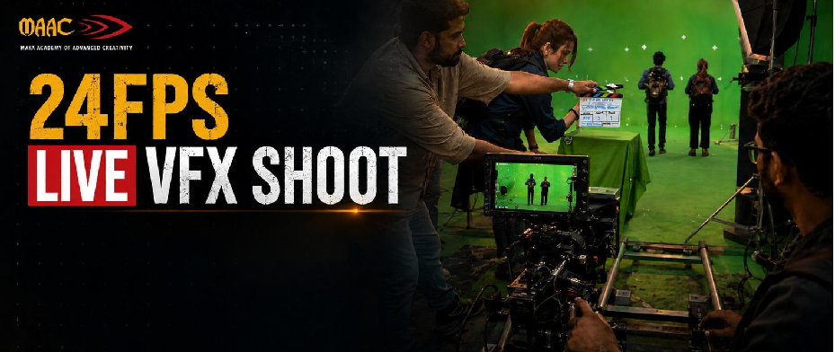
Behind the Scenes of the 24FPS VFX Shoot: Where Creativity Meets Industry Practice
Your Future Starts Here!
Discover a wide range of programs designed to empower your future. Whether you're starting your academic journey or advancing your career, our courses are tailored to help you succeed in today’s competitive world.
Start Your MAAC Journey
Reach out to us today and take the first step toward your creative journey with MAAC.

Ask Me