Evolution of logo design is a constant process. As mentioned in our previous blogs – Evolution of logo design-Part 1 & Evolution of logo design-Part 2 – social, political & economic changes have always made an impact on the evolution of logo design. In this last part of the series, we will look at where does logo design stand today & what is its future.
1945 – 1970: Late modern – Simple became the new complex
As the political scenario changed, and things started to look more peaceful, arts too took a non-decorative, simple approach. This introduced a new form of simplicity in logo designs. The late modern era simplified & dramatised the integration of text & images through pictorial collages & overlapping shapes.
National Broadcasting Company (NBC)

As symbolic logos became the rage, NBC became one of the first to take advantage of the change. The NBC logo (designed in 1943) had only a microphone, with the network’s initials, surrounded by lightning bolts. Over the years, the logo has witnessed changes as per the changing times. But as per logo designers, this original logo remains one of the best & most powerful designs. This logo highlighted the style of the age – simple elements with a clean look, and intelligent illustration.
C(ut)opy. Copy. Paste.
![]() Taking the smart way out, logo designers during this period took advantage of the existing graphic elements, and made them look more dramatic. The original Xerox logo (1947) used a strong, tablet-shaped black & yellow logo that was both appealing & memorable.
Taking the smart way out, logo designers during this period took advantage of the existing graphic elements, and made them look more dramatic. The original Xerox logo (1947) used a strong, tablet-shaped black & yellow logo that was both appealing & memorable.
Simple. Effective. IBM
![]()
To stay with the times, IBM revised its logo in 1956. This new logo was a giant leap from the one designed in 1924. By sticking to a simple typography, this logo proved that simple can not only be more effective, but can prove to be the hardest to create. Ever since, IBM has maintained its simple, typography-based logo.
The smart selling techniques
![]() Logo was no longer just an identity. It was fast becoming an important part of marketing a company. The focus shifted from hard selling to smart selling. Kodak was a pioneer in this respect. It turned the company name & look into a symbol, soon after adding a corner curl to the logo. Things were slowing moving towards finding clarity in chaos.
Logo was no longer just an identity. It was fast becoming an important part of marketing a company. The focus shifted from hard selling to smart selling. Kodak was a pioneer in this respect. It turned the company name & look into a symbol, soon after adding a corner curl to the logo. Things were slowing moving towards finding clarity in chaos.
1975 – 1990: Post modern – Breaking the rules
Postmodernism made an impact on everything, from arts to literature, from music too business. During this period graphic designers returned to ornamentation, symbolism & visual wit. This era challenged the obsession with progress & speed, and deliberately used funny-looking characters, odd colour combinations, and random textures.
Starbucks
![]()
Starbucks was not always green. The brand was named after a nautical character, and the original logo was designed to evoke sea imagery. The Mermaid mascot, fondly called ‘the Siren’, is considered one of the most intelligently used elements, and remains a constant figure throughout the evolution of logo design for Starbucks.
MTV
![]()
Representing the young & the cool, MTV is more than a channel. It inspired an entire generation – the MTV generation. And the MTV logo played a huge part in this change. Considered the most dynamic postmodern logo, the shape & size of all the elements have remained the same throughout the evolution of logo design. Only the colours & patterns have changed over the course of time.
Steve Jobs 28 degree angle
![]()
In a bid to remain unconventional, and to break the rules, Paul Rand designed the NeXt logo for Steve Jobs. But the process wasn’t as simple as the logo looks. It is believed that Rand created a 100-page brochure detailing the brand, including the precise angle used for the logo (28°), and the new company name, NeXT.
Make a mark
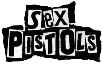
Since all kinds of experiment were now possible, even an odd anatomy was welcome to the group. This was the period of unusual wit & intelligence. Formed in 1975, the logo for Sex Pistols, a punk rock band, is a perfect example of this trend. The typography used wasn’t designed or invested by a designer; it was cut-off from a newspaper, literally.
1985 – 2K: Digital – Age of Adobe Illustrator
The beginning of the digital era requires a special mention in the evolution of logo design. In fact, digital era logos are still present all around us, and are not restricted to any particular style. They can be anything they choose to be – messy, chaotic, extreme, absurd, layered, illegible, unstable, expressive, poetic or grungy.
HP
![]()
The HP logo history has been an inspiration for graphic designers around the world. Designed in 1981, the logo makes the ‘h’ & p expressive & prominent. The tail & ascender of both the letters are extended all the way to the top of the rectangle, indicating expansion & innovation.
Intelligence inside
![]()
Holding up the principle of ‘the simpler, the better’, the Intel logo makes intelligent use of a disjointed circle to create a charming design, which remains a constant feature of the logo till date.
Vertical limit
![]()
Since there were no more restrictions on the dos & don’ts of logo design, the GAP logo took ‘stressed typefaces’ to the next level. In 2010, the company tried to change its logo. But following negative response, it went back to its original logo.
Mathematical possibilities
![]()
Graphic designers also included mathematical combinations & functions in logo design. Bayer, the multinational chemical & pharmaceutical company, adopted a logo to represent its presence in the scientific field.
2001 – Present: Minimalism & Flat
Logo design has come a long way. Innovation & collaboration have become the order of the day. And with each passing day, logo designers are trying to achieve even more simple & minimal designs. A 3D illusion is fast becoming the focus, along with simple elements, typography & flat colours.
Apple
![]()
The logo has long been a trademark in the design circuit worldwide. It’s simple, effective & memorable. And the bite out of the fruit was intentional; a tribute to Alan Turing & his contribution to the field of computer science & coding.
Target
![]()
Moving miles away from the early logo, Target’s bull’s eye logo represents the name – a single red ring with a dot in the middle. The logo uses Helvetica typeface, and is considered to be the best design in Target logo history.
Volvo
![]()
Going back to its roots, the Volvo logo depicts the pre-historic symbol of iron; also representing the Roman god of war – Mars. The logo has stood the test of time.
Audi
![]()
The minimal logo design encompasses the history of the company. The four rings in the logo represent the merger of four independent motor-vehicle manufacturers – Audi, DKW, Horch, and Wanderer.
Museum of London
![]()
The Museum got a new look in 2009. The idea was to represent the different geographical shapes that London has taken over a period of time – right from medieval times to today. Following a pattern which has been over half a century old, the typography is simple with overlapping illustrations.
![]()
Google logo history is as fascinating it can get. The most recent Google logo, launched on September 1, 2015, showcases a capital letter ‘G’ in tailor-made typeface with segment coloured red, yellow, green, and blue.
The evolution of logo design represents not just design change, but also social & political changes. A logo design represents both the brand & its philosophy. With changing times it is important for logo designers to find creative ways of communicating a brand’s promise to its customers. After all, a good logo is the first step of creating brand loyalty.