“……..Why do two colors, put one next to the other, sing?
Can one really explain this? No. Just as one can never learn how to paint……”
– Pablo Picasso
The beautiful world around us is filled with colors. Without color all things around us would have been pale and lifeless.
Color is one of the most important elements of a composition, be it painting, photography, film or 3D rendering. Color plays a critical role in our everyday life. Color can sway thinking, change actions, and cause reactions. Color can attract any individual’s attention or change their mood. It can cause irritation or soothe your eyes.
Artists, over the years, have used color purposefully to attract attention to their piece of art. The utilization of color is one of the most effective means of creating impact in images.
However, to use color effectively, one must understand a little about color. Artists, film makers and all related to the field of visual communication have been successfully using it over the years to communicate to their audience.
There are four major aspects in any color – Hue, Saturation, Value and Temperature.
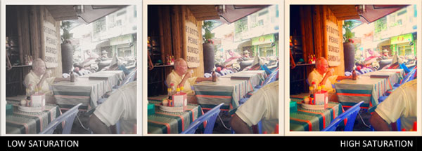
Hue is an important property of color that describes the actual color in the color wheel. Saturation defines how intense or pure the color is in the color wheel. The presence of saturated hue/color in the composition gives a vivid and pure look to an image, thereby making the image more dynamic. However, excessive usage of high saturated colors in any composition may be confusing as each saturated color would compete with the other for dominance. This may case fatigue to the eyes of a viewer. An image with the dominance of less saturated color looks white washed.
The Value of color determines how light or dark the color is in its shade. This aspect of color is used extensively to depict the spatial form of an object. Closer color values can make an image look flat, whereas contrasting color values enhance the form of the object in an image and provide a sense of depth.

Value is used to guide a viewer’s eye and create emphasis in a composition or design. A lighter color will be more prominent in a darker background and vice versa. A color’s lightness or darkness may vary based on the color values present around it and its background. The below image will help us understand the same.

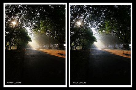
As far as the Temperature of a color is concerned, certain colors are generally associated with warmth and others with cold. Colors like red, orange and yellow are warm colors while blue, green and violet are cold. The higher the presence of red in a color, the more would be its appeal as a warm color. On the other hand, addition of blue will make a color appear as a cooler one. Warm colors tend to appear in the foreground of an image while cooler colors recede into the background. This can be used effectively to direct the viewer’s eye in the composition. Since cooler colors recede you may decide to use them for background elements while warm colors make a good choice for elements in the foreground.
Many attributes of color-like saturation (color purity) and value (range of light to dark) – are known to evoke emotions in an individual and create moods. Lighter colors have positive impact whereas darker colors are known to impact adversely. You can create a lot of changes in a photograph clicked after you take it through various digital photography tricks.
Picking the best color for an image or a composition is not as easy as it may sound. What may be a ‘good’, ‘right’, or a ‘beautiful’ color for a composition may not be valid or work with any other imagery in context to the various other color values present. Choosing a perfect color is not about choosing it in isolation, but to select it based on the context of other colors present in the visual.